Getting started
Create the form
After successfully installing Joomlab Form on your website, navigate to the form management page from the admin panel by following the path MainMenu > Components > Joomlab Form > Manage Forms, from the main top toolbar click on the New button to create a new form
2. Build the form
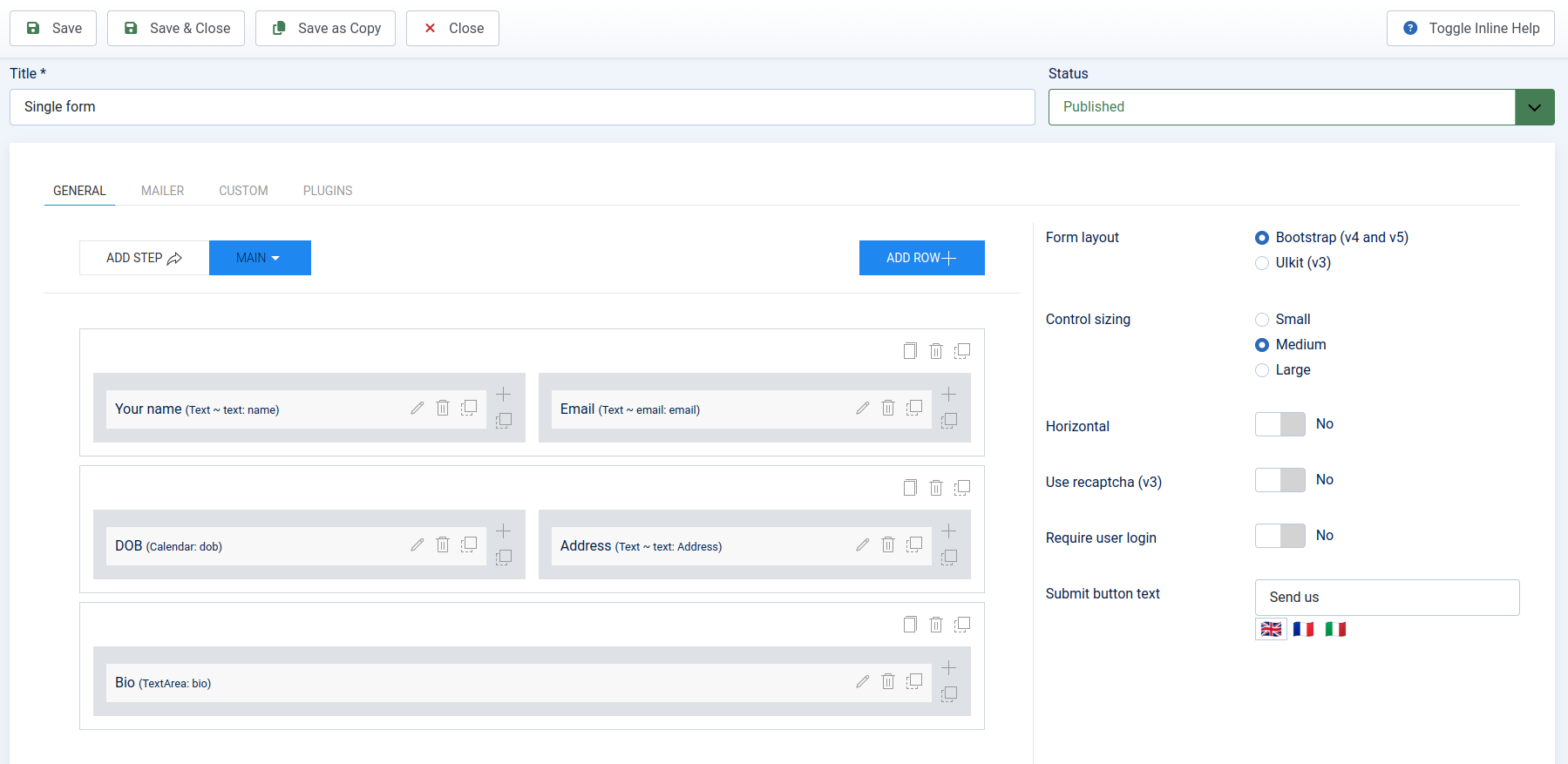
From the General tab, locate and click the ADD ROW button to add a new row. A popup will appear displaying the column layout options for the new row. Each layout visually represents the size and number of columns. Click on a layout to start adding a new row.
Once the new row appears, you can copy or delete it if needed. If the row contains two or more columns, a icon will appear next to the icon . Click and hold the mouse, then drag and drop to rearrange the columns. This works similarly for rearranging rows.
Click on the icon icon in the top-right corner to add a new field Click on the icon icon in the top-right corner to add a new field, A popup with the field's information will appear.
Field general
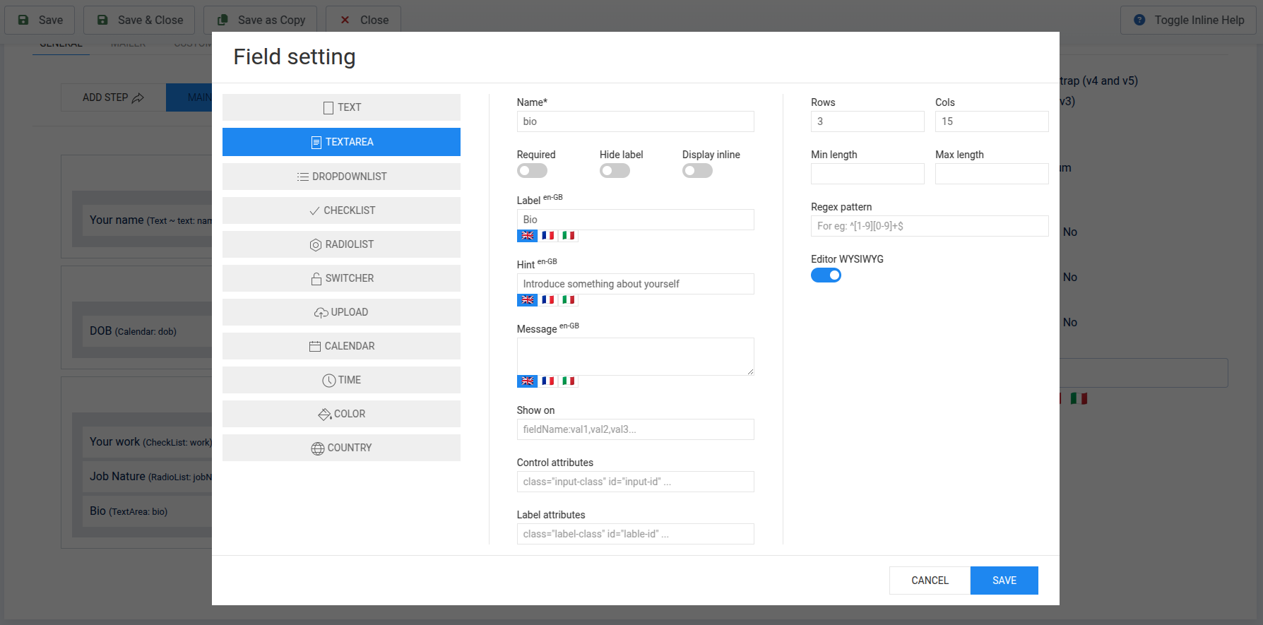
Click to select a field type from the list of fields on the left side of the popup. The middle column contains the basic information for the field, while the far-right column displays the attribute components of the field.
- Name(*): The field name is required and should be unique to avoid conflicts with other field names.
- Required: Toggle the field is required or not.
- Hide label: Toggle the label is hidden or visible
- Display inline: Toggle the label will display inline (horizontal) or not, if it's enabled this will override the default horizontal setting of the form
- Label: The label for the field, if it's empty it will be auto-generated from name.
- Show on: Enter the display condition for the column, similar to Joomla!'s "Show On" feature, see more.
- Hint: Corresponds to the HTML placeholder attribute for the input.
- Message: The error message displayed when the field fails validation during form submission. Note that this message will override the form's default messages.
- Control attributes and Label attributes: These represent the HTML attributes for the input and label, expressed as strings, similar to how you write HTML code. Note that the name and id attributes are dynamic and will be omitted.
Field options
- TEXT: A text field with four formats: Text, Email, Number, Password and Free Text.
- Text, Email, Password and Number: HTML
<input>tags with the corresponding types. - --Text: Includes options for minimum length, maximum length, and regex patterns for field validation.
- --Email: A toggle for sending emails. If enabled, the user's email address will receive the email.
- --Number: Options include requiring integers and specifying minimum and maximum values.
- --Password: HTML
<input type="password">. - --Free Text: A freely entered string (including HTML) displayed on the page.
- Text, Email, Password and Number: HTML
- TEXTAREA: Includes options for columns, rows, minimum length, maximum length, and regex patterns, similar to TEXT
- DROPDOWN LIST: A HTML
<select>tag with single/multiple selection options- Click ADD ITEM to add sub-options, which can be rearranged or deleted.
- Note: The FREE version allows a maximum of 5 options.
- CHECK LIST: HTML
<input type="checkbox">tags with options similar to DROPDOWN LIST. - RADIO LIST: HTML
<input type="radio">tags with options similar to DROPDOWN LIST. - SWITCHER: A Yes/No toggle with customizable labels (default is "Yes" and "No").
- UPLOAD PRO only:
- Options for multiple file uploads and attaching uploaded files to emails.
- Note: File attachment success depends on email service providers.
- Includes file type restrictions and maximum file size.
- CALENDAR:
- Options for format and 24-hour time display.
- Advanced options are only available in the PRO version.
- TIME: Displays a time picker with 24-hour format options and inline display settings.
- COLOR: A color picker without additional options.
- COUNTRYPRO only:
- Similar to DROPDOWN LIST, but pre-lists all countries.
- Options to display country names in English, local language, or both.
- Toggle the visibility of countries using the check/uncheck button next to each country item.
Form steps PRO only
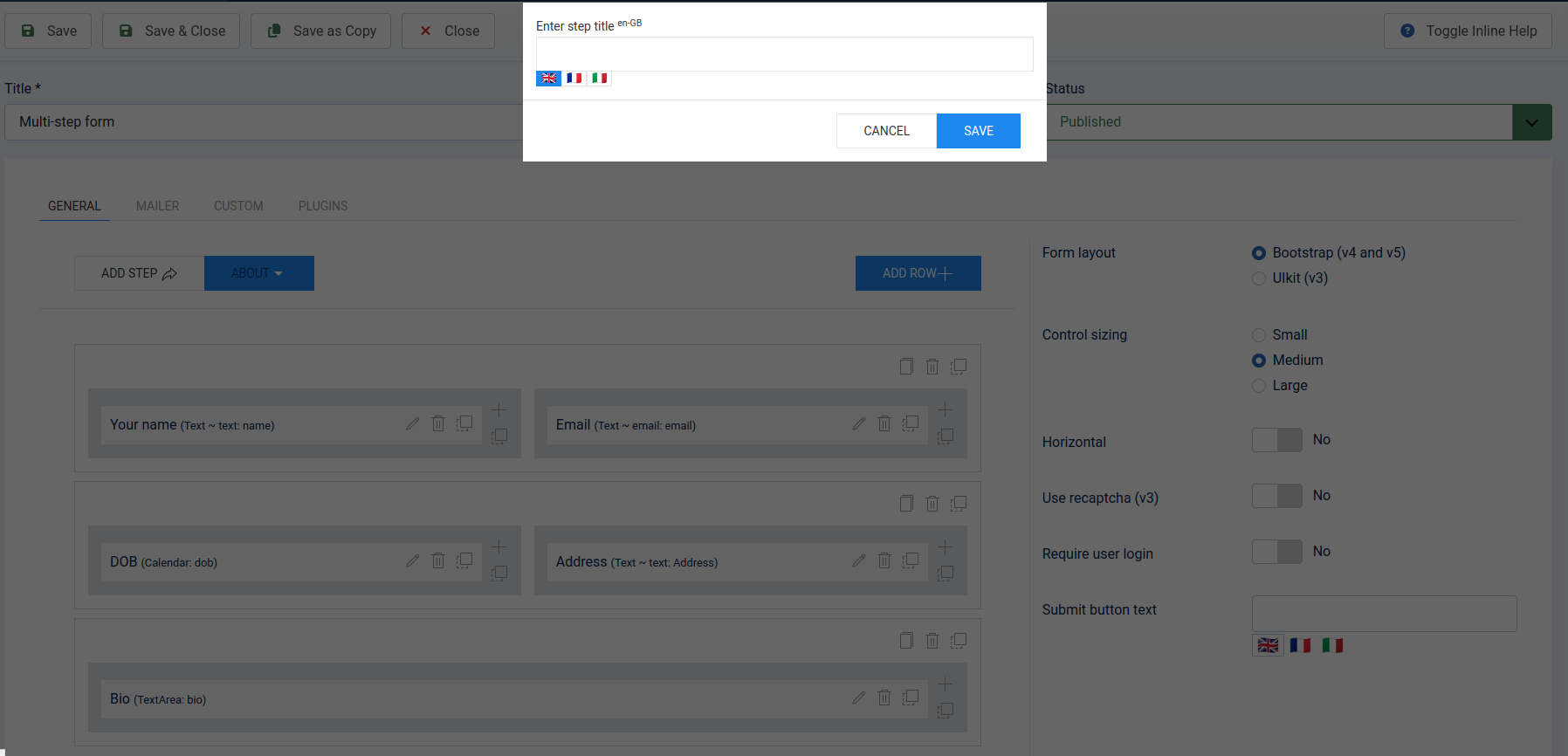
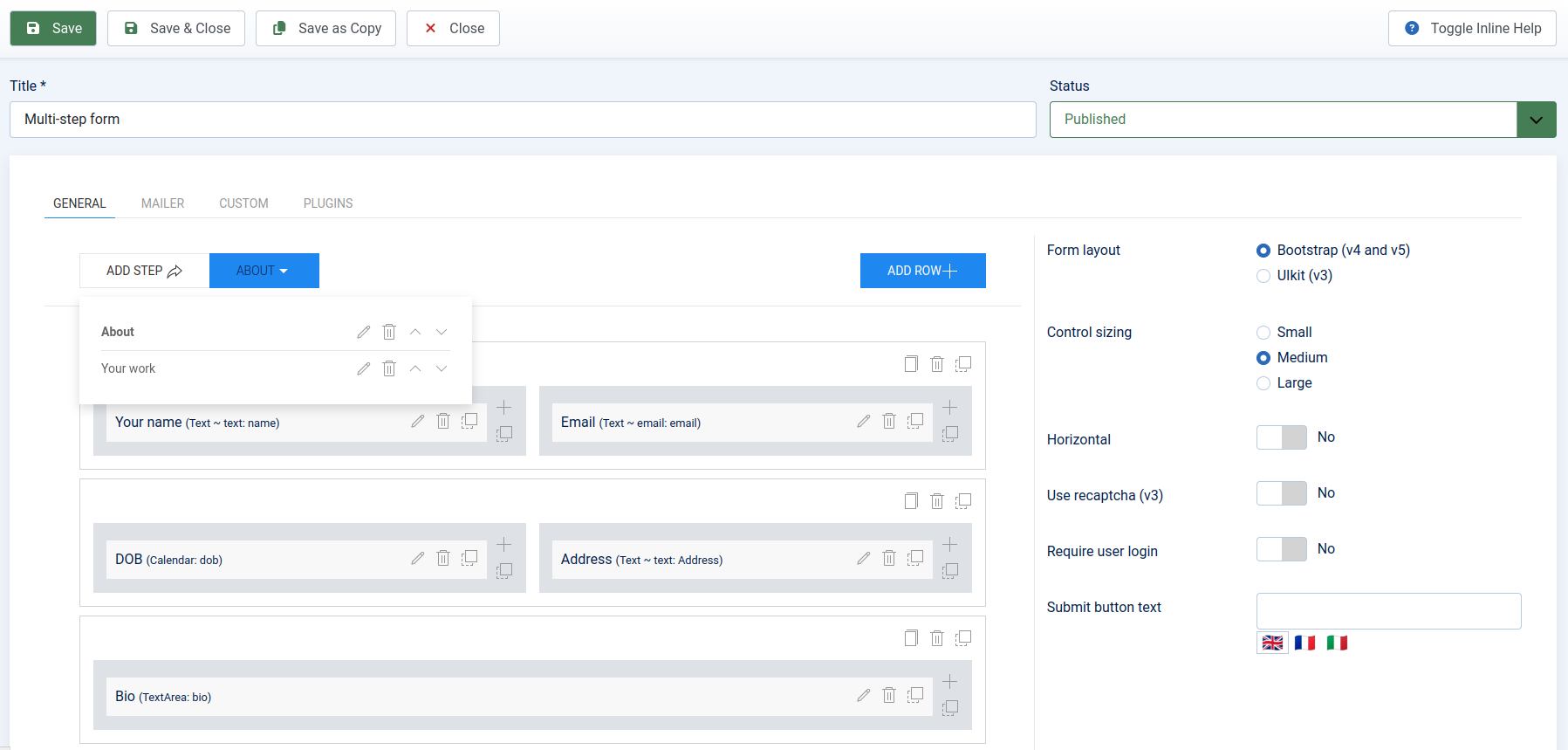
Create a new step by clicking the ADD STEP button on the form builder page. A popup will appear, allowing you to enter the title of the step. Click the dropdown button to the right of the ADD STEP button to view the list of steps. Here, you can reorder the steps, delete them, or edit their titles.
Clicking on each step will switch the display to show the list of fields for that specific step.


